 Source Code
Context
Ralfy is a LinkedIn feed management tool I built over the past two months. Custom feeds, AI comments, reply drafts. I handle design, code, and product on my own.
I built the whole thing with AI. Frontend, backend, database, deployment. Claude wrote most of the code while I focused on product decisions and design direction. Speed was the priority, so there was no design system, no shared tokens, no component library.
The app also has a Chrome extension that surfaces LinkedIn content alongside the main dashboard.
The Problem
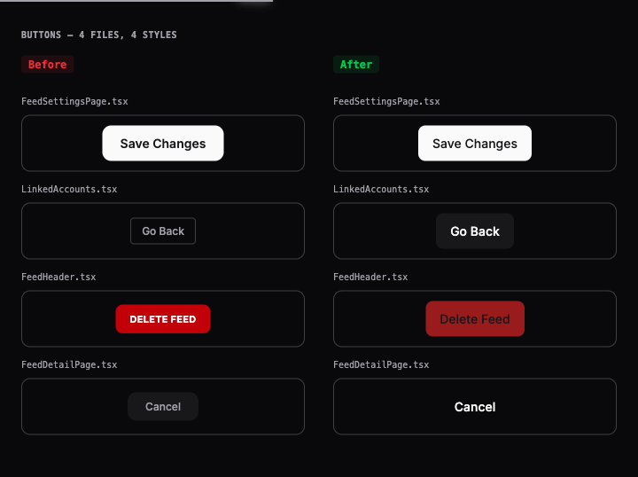
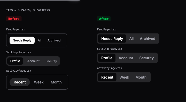
Every component was built differently. Four screens, four button styles. Tabs built three ways. No shared patterns, no shared tokens, no reusable parts.
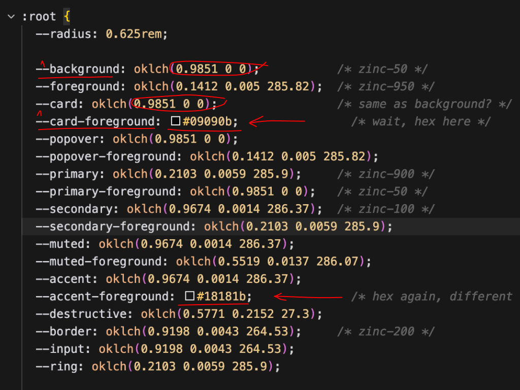
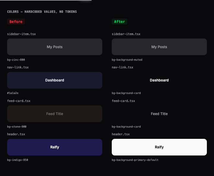
There was no single source of truth. Colors were hardcoded oklch values or CSS variables duplicated under different names for the same role. Changing the primary color meant searching the codebase and hoping I found every instance.
I needed guardrails. Not just components, but a system that prevents this drift from happening again. So I gave myself a challenge. Build the full pipeline in 2 days with AI.
Approach
The goal was a complete workflow from Figma to production. Not just components. The pipeline that keeps everything in sync. Change a token in Figma and the production app reflects it. No component code touched.
Trade-offs
- Tokens first, not components first. Tokens constrain decisions. Without them, components drift.
- Custom system, not a shadcn copy. I needed the full pipeline from Figma to production. Not just pre-built UI.
- CSS custom properties, not runtime CSS-in-JS. Zero runtime cost. No bundle overhead. Tree-shakeable exports.
Token Architecture
Semantic tokens reference primitives. Components only use semantic tokens. Swap the primitives and every component updates. No code changes needed.
--background-primary-default: var(--primary-900);
--foreground-default: var(--zinc-950);
--border-default: var(--zinc-200);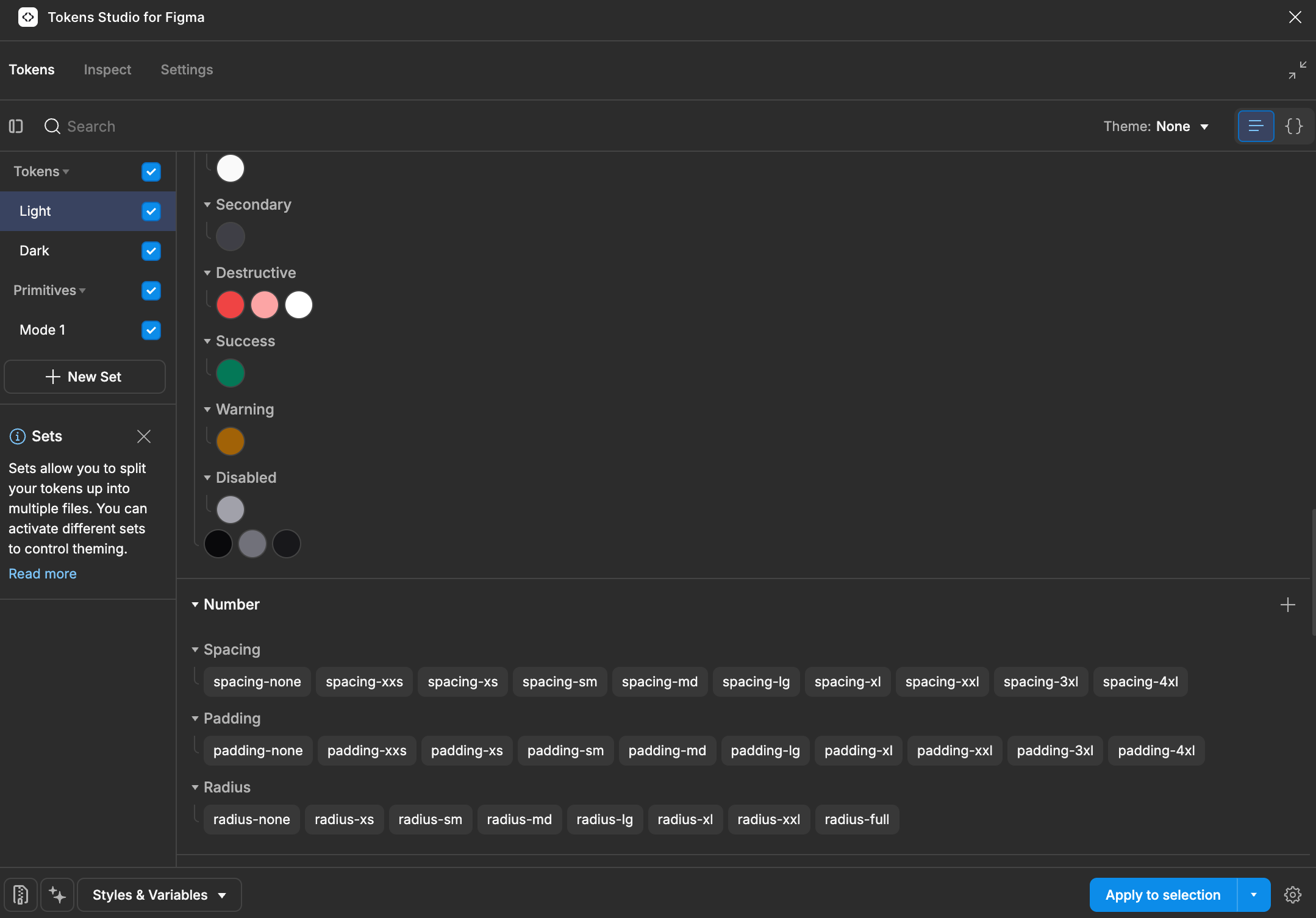
CSS distribution was the hardest problem. Tailwind v4 resolves @source paths from external packages differently.
The fix: a dedicated styles.css entry point that bundles token imports and @theme inline mappings. One import. Done.
Components
Figma to Storybook
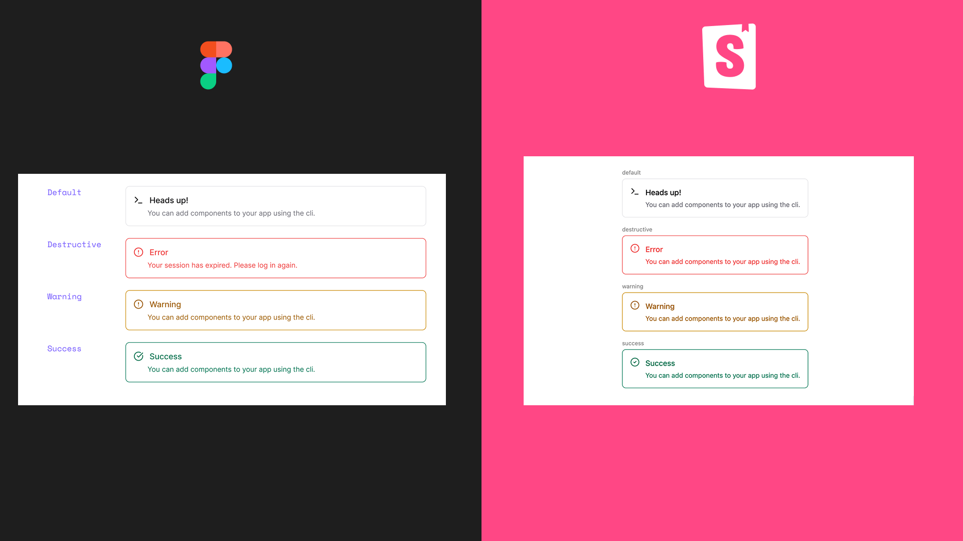
Every component follows the same four steps:
- Read the design via Figma MCP. Pull variants, sizes, states, and tokens.
-
Map tokens. Figma names map 1:1 to Tailwind classes.
Background/Primary/defaultbecomesbg-background-primary-default. No translation needed. -
Build.
cvafor variants.React.forwardRef.cn()for class merging. Every state gets a token. Keyboard nav, focus rings, semantic roles. - Verify in Storybook. AllVariants story shows every combination. Autodocs page generates the props table. Visual check against the Figma source.
Component Deep Dive: Tabs
The production app had tabs built three different ways. Same concept, different code. One used divs with onClick. Another had custom keyboard handling. A third skipped focus states entirely.
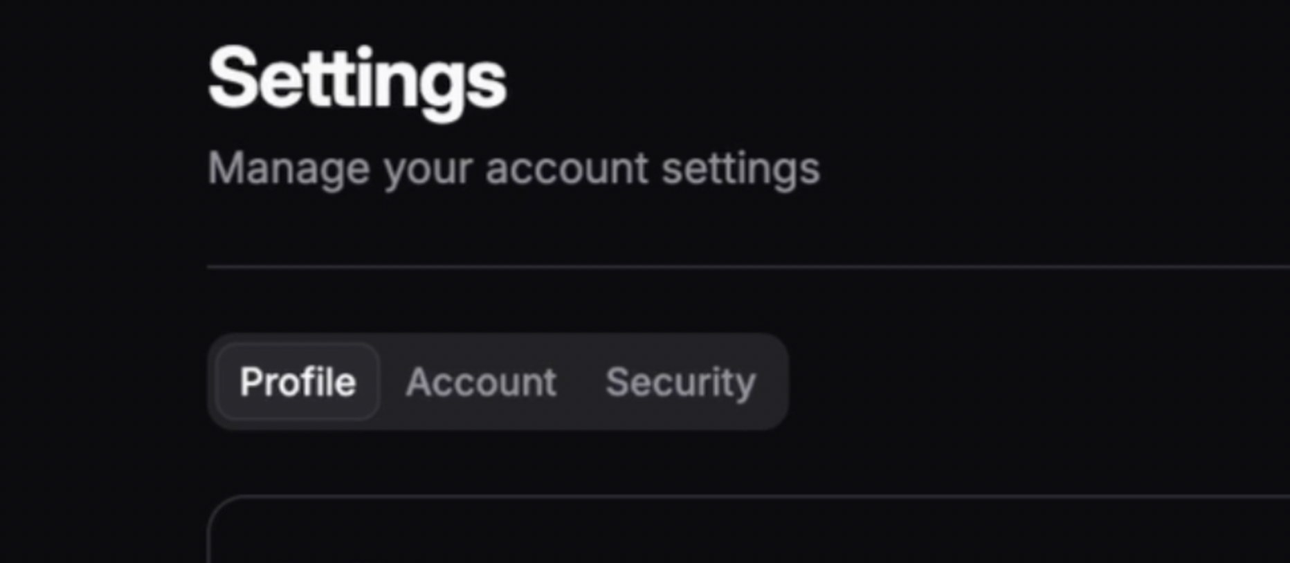
Tabs is built on Radix Tabs. Arrow-key navigation, aria-selected, roving tabindex,
all handled by the primitive. I wrote zero keyboard logic. Zero ARIA attributes by hand.
I focused on the tokens and variants that make it look right in the system.
One component. Every screen that needs tabs gets the same behavior, the same keyboard nav, and the same visual treatment.
What I Built
Five components, each following this workflow:
| Component | Pattern | What This Proves |
|---|---|---|
| Button | asChild via Radix Slot. Six variants, four sizes, loading state. |
Token-per-state system (default, hover, focus, disabled all tokenized) |
| Alert | Four semantic variants with role="alert". |
Accessibility contract (screen readers announce status changes) |
| Sidebar | Compound: Brand, Menu, Item, Group, Separator. Collapsed mode. | Compound architecture scales (16 sub-components compose freely) |
| Tabs | Radix Tabs: arrow-key nav, aria-selected, content panels. |
Platform primitives over custom JS (full keyboard nav for free) |
| TabItem | Standalone role="tab", three sizes, icon support. |
Flexible composition (works inside or outside Tabs compound) |
Storybook to Production
Using the system should be simple. A developer needs three lines:
// 1. CSS (once, in your app's entry point)
@import 'ralfy-ui/styles.css';

// 2. Use
import { Button } from 'ralfy-ui';

<Button variant="primary" size="md">Save</Button>
Tokens, dark mode, and styles come through automatically. No setup. No theme config. No extra CSS imports. Changes hot reload in Storybook for fast visual checks.
AI-Assisted Development
The project includes CLAUDE.md. It lists every token class,
component API, variant, and accessibility rule. It works as
documentation-as-governance. The AI follows the system by default.
Without CLAUDE.md:
<button className="bg-[#1a1a2e] text-white px-4 py-2 rounded-md">
  Save
</button>
With CLAUDE.md:
<Button variant="default" size="md">Save</Button>The first creates a maintenance problem. Hardcoded values. No dark mode. No focus ring. No loading state. The second inherits all of that for free. This is how I built 5 components with 63 tests in 2 days.
I also created a figma-to-component skill. It reads a Figma design via MCP,
maps tokens, generates the component, creates Storybook stories, and runs the build.
It turns a multi-hour manual process into a repeatable workflow.
But it's not just one skill. I built a set of them covering the full component lifecycle. Each skill encodes a workflow that would otherwise live as tribal knowledge. Together they make the entire pipeline from Figma to production repeatable by anyone with access to the repo.
Results
Buttons
Colors
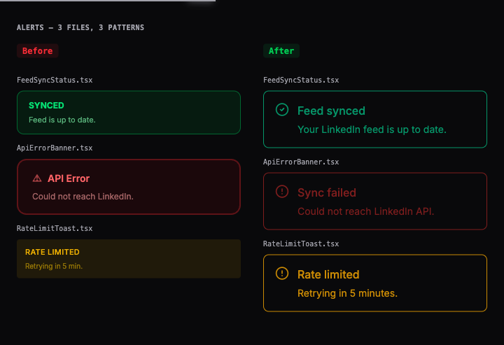
Alerts
Tabs
Built in 2 days: 5 components from Figma, 63 tests, Chromatic deploy, and a repeatable workflow from design to production.
What this enables:
- Change one token, every component updates. No component files touched.
- New developer onboarding: one file (CLAUDE.md) instead of tribal knowledge about which classes to use.
- Adding a component: repeatable workflow, not a from-scratch effort each time.
What's Next
The system and pipeline are in place. Next is a full UI pass across the app. Replace every hardcoded color with a token. Fix layout consistency. Make the design system the single source for all UI decisions. The audit already mapped what needs to change.
Reflection
At scale (30+ engineers, volunteer Component Librarians), this system would need component-level tokens and formalized contribution guidelines. Chromatic visual diff approval on every PR. No component ships without a visual review. Storybook becomes the reference that both designers and engineers trust.
Five Lessons
- Start with tokens, not components. Tokens constrain every decision downstream. Get them right first.
- Build what you use. Every component exists in production. Zero speculative work.
- The workflow matters more than the components. Anyone can build a Button. The value is in the pipeline that lets teams ship faster.
- AI needs guardrails. Without CLAUDE.md, AI generates hardcoded colors. With it, AI follows the system by default. The spec is the multiplier.
- A 2-day sprint can prove a system. The point was not to build every component. It was to prove the workflow end to end. Scaling is just repeating a solved process.